This article explores Akupanes’ diverse color choices in interior decoration and analyzes how to enhance spatial aesthetics and functionality through different color combinations. The article provides a detailed introduction to Akupanes’ color classification, applicable scenarios, and matching techniques, helping readers better utilize Akupanes to create personalized indoor environments. At the same time, suggestions on the application of color psychology in design are also provided to optimize spatial atmosphere.
Akupanes, as a multifunctional and environmentally friendly decorative material, has become increasingly popular in interior design in recent years. Its unique acoustic performance and aesthetic value make it the preferred choice for modern home and commercial spaces. Akupanes’ color selection provides unlimited possibilities for designers and homeowners.
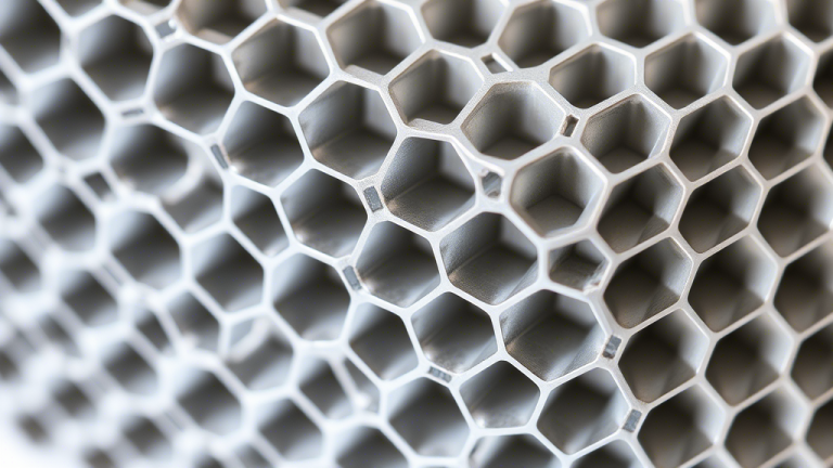
Color classification of Akupanes
Akupanes offers a variety of color options, from classic neutral tones to bold bright colors, to meet the needs of different styles. Common color classifications include:
Neutral colors such as white, gray, and beige are suitable for creating a simple and modern atmosphere.
Natural color schemes: such as wood grain, green, brown, suitable for creating warm and natural spaces.
Bright color scheme: such as red, blue, yellow, suitable for highlighting key areas or adding vitality.
Applicable scenarios and matching techniques
Akupanes in different colors are suitable for different spaces and scenes:
Living room: Neutral colors can create a sense of spaciousness, while bright colors can increase visual focus.
Office: Natural color schemes help improve focus, while bright color schemes can stimulate creativity.
Restaurant: Warm colors such as orange and red can increase appetite, while cool colors such as blue are suitable for creating a peaceful atmosphere.
In terms of matching techniques, it is recommended to choose the main color tone based on the function and overall style of the space, and increase the sense of hierarchy through contrasting or gradient colors.
The Application of Color Psychology in Akupanes Design
Color psychology research shows that different colors have a significant impact on people’s emotions and behavior. For example:
Blue: Helps with relaxation and concentration, suitable for use in work or study spaces.
Green: symbolizes nature and balance, suitable for use in rest areas or health centers.
Red: Inspires vitality and enthusiasm, suitable for use in sports venues or social spaces.
When using Akupanes in design, color psychology principles can be combined to optimize the functionality and user experience of the space.
In short, Akupanes’ color selection provides rich possibilities for interior decoration. By reasonable combination and application, a space environment that is both beautiful and practical can be created.